Demostack
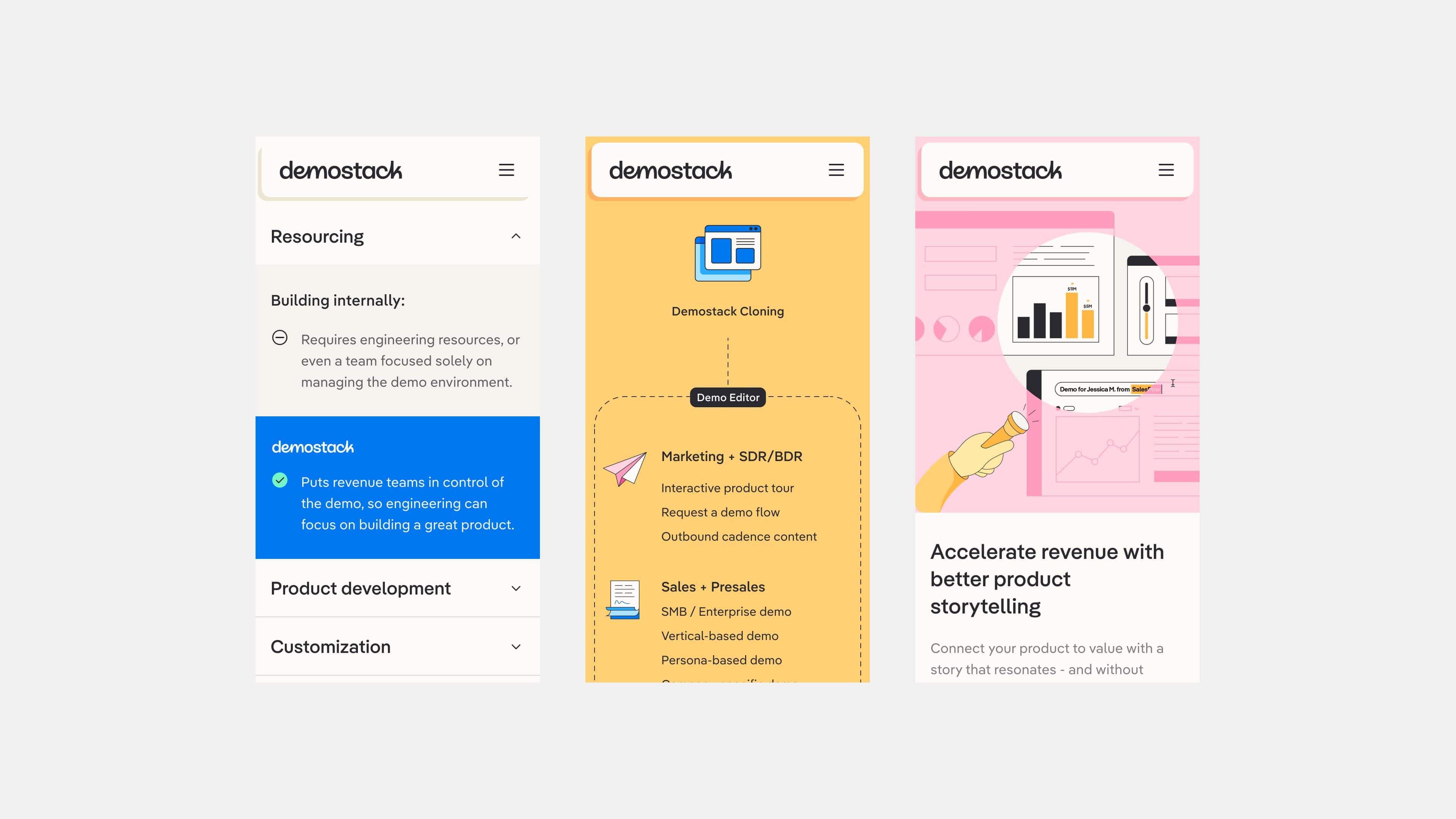
Demostack is a tool enabling Sales members for software products to showcase their software without relying on R&D to create their own demos. Demostack creates a replica of their software which is editable to fit the experience of a proposed client. I worked with DesignStudio throughout the website phase of the project. From content and UX workshops to visual design and assisting throughout the development phase.
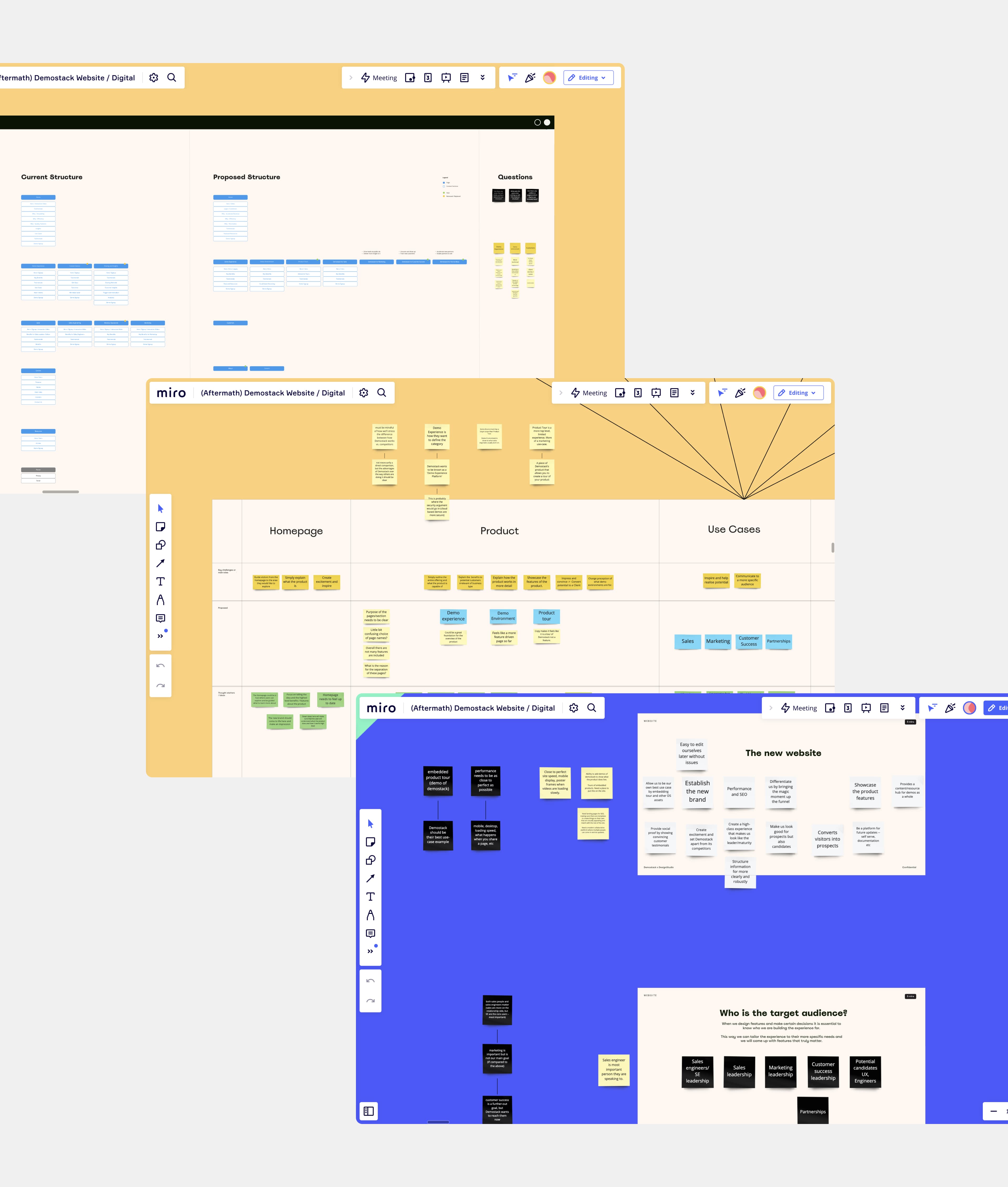
The project was kicked off with workshops with the client to align on the overall strategy, user flows and content structure of the site.
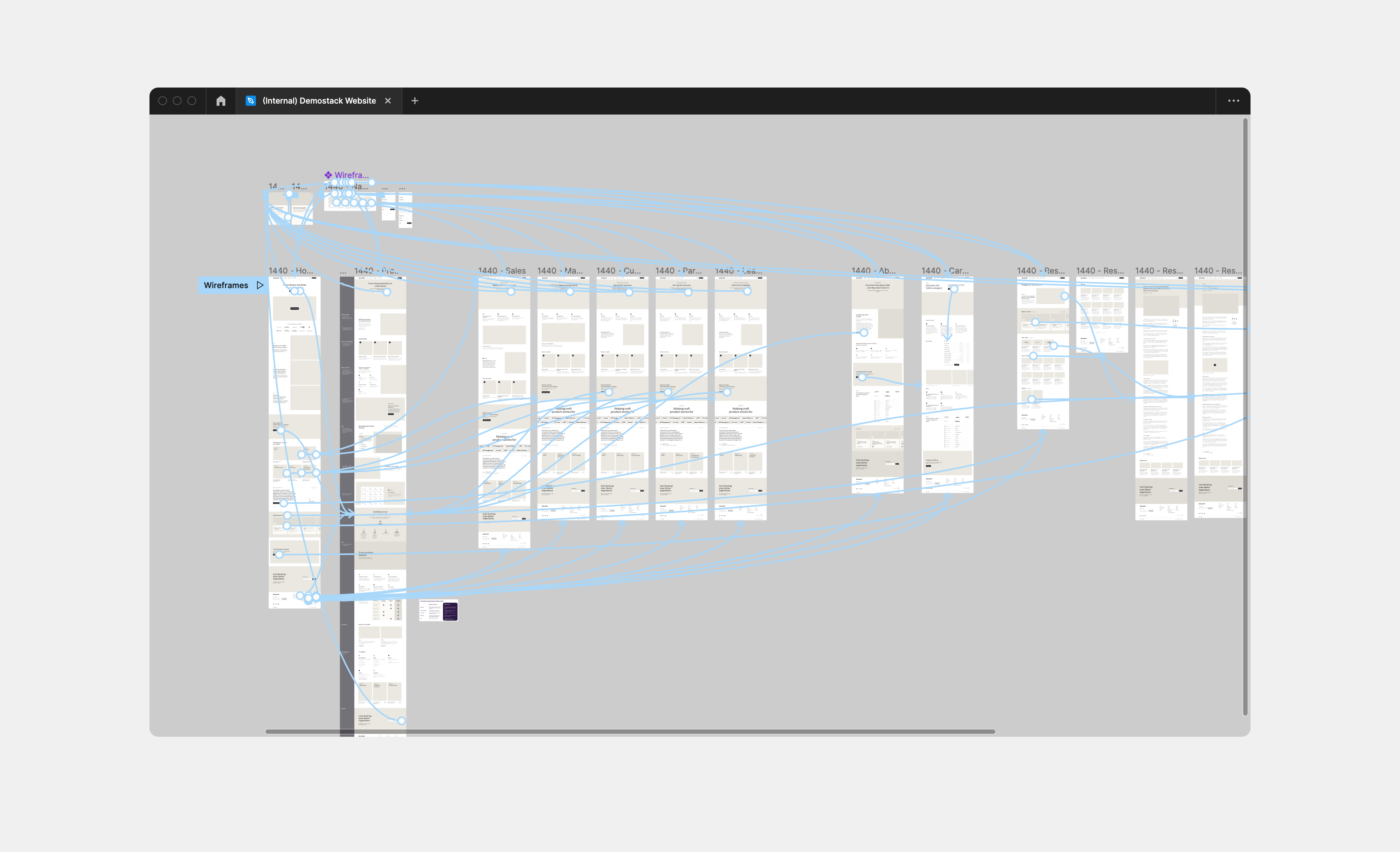
Following workshops, a simple prototype was produced to bring the content structure to life so the client could visualise the user-journey clearer.
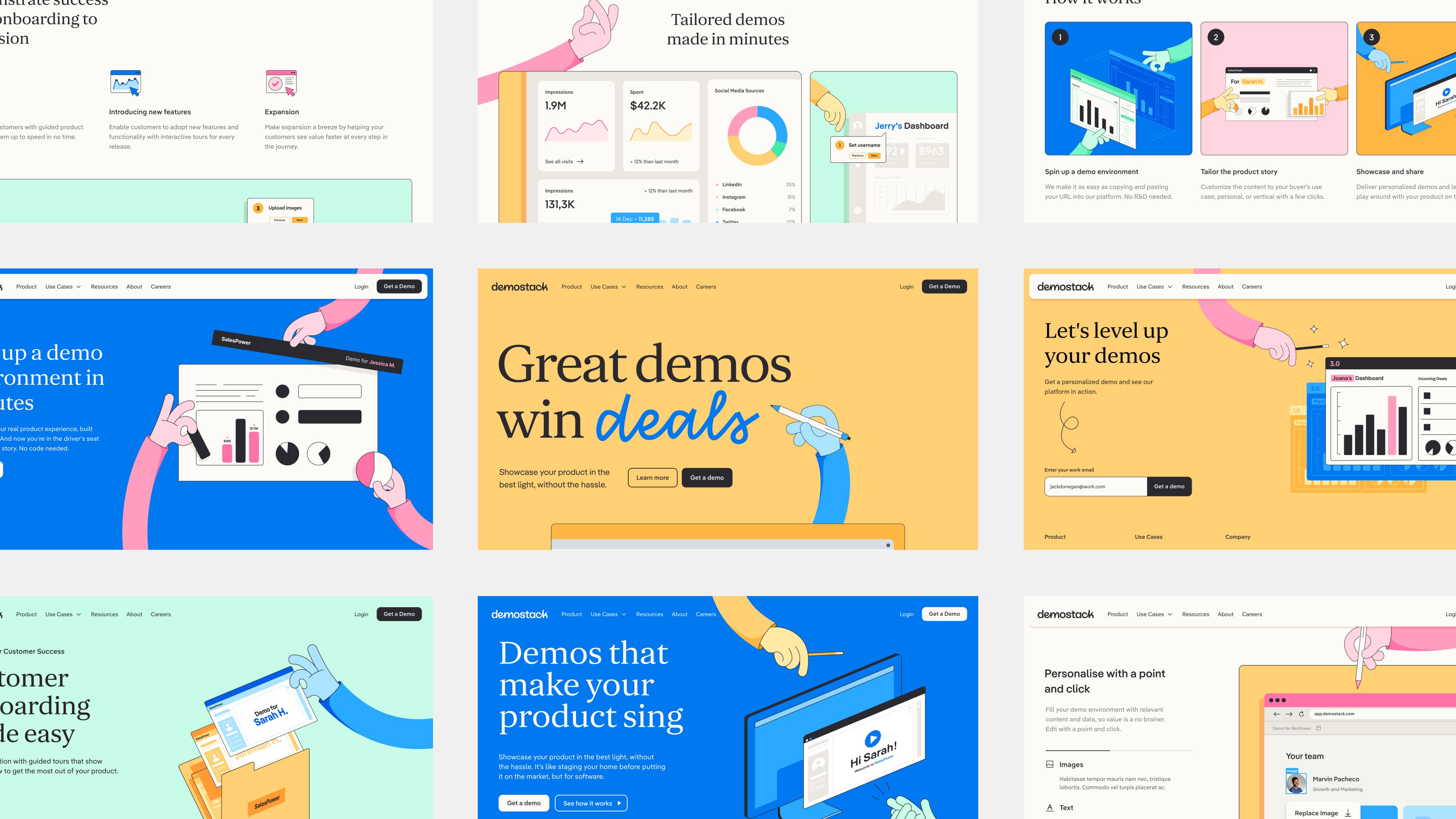
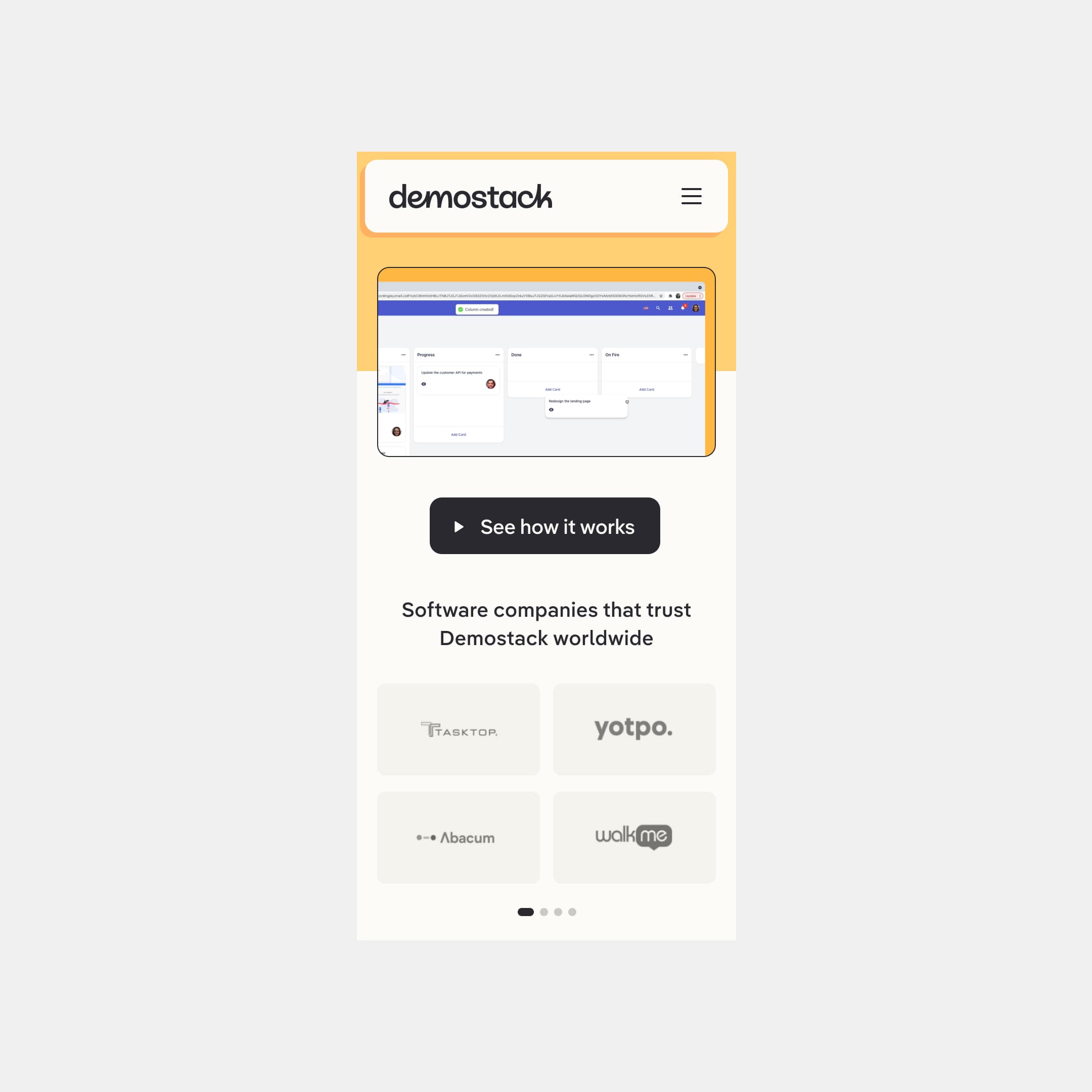
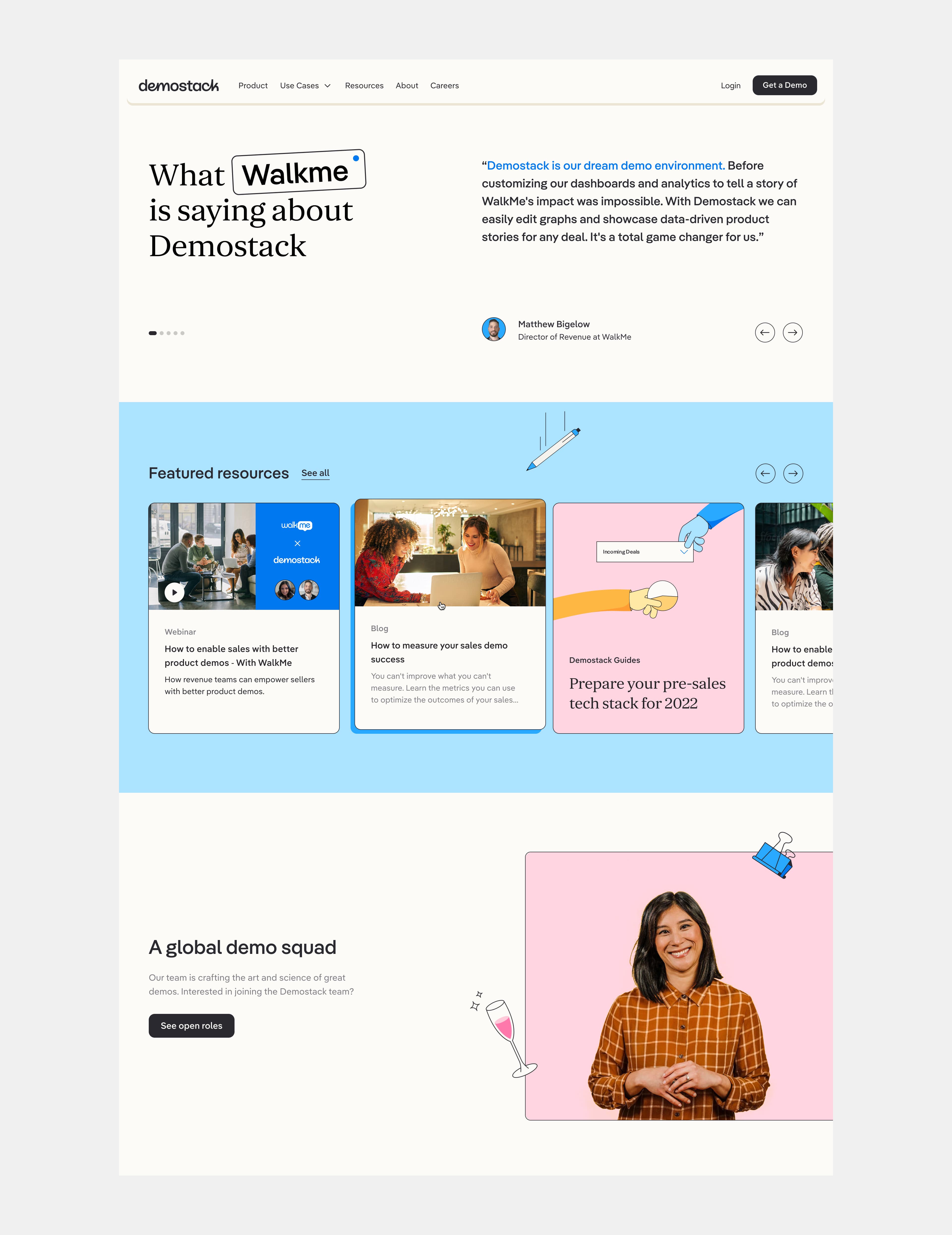
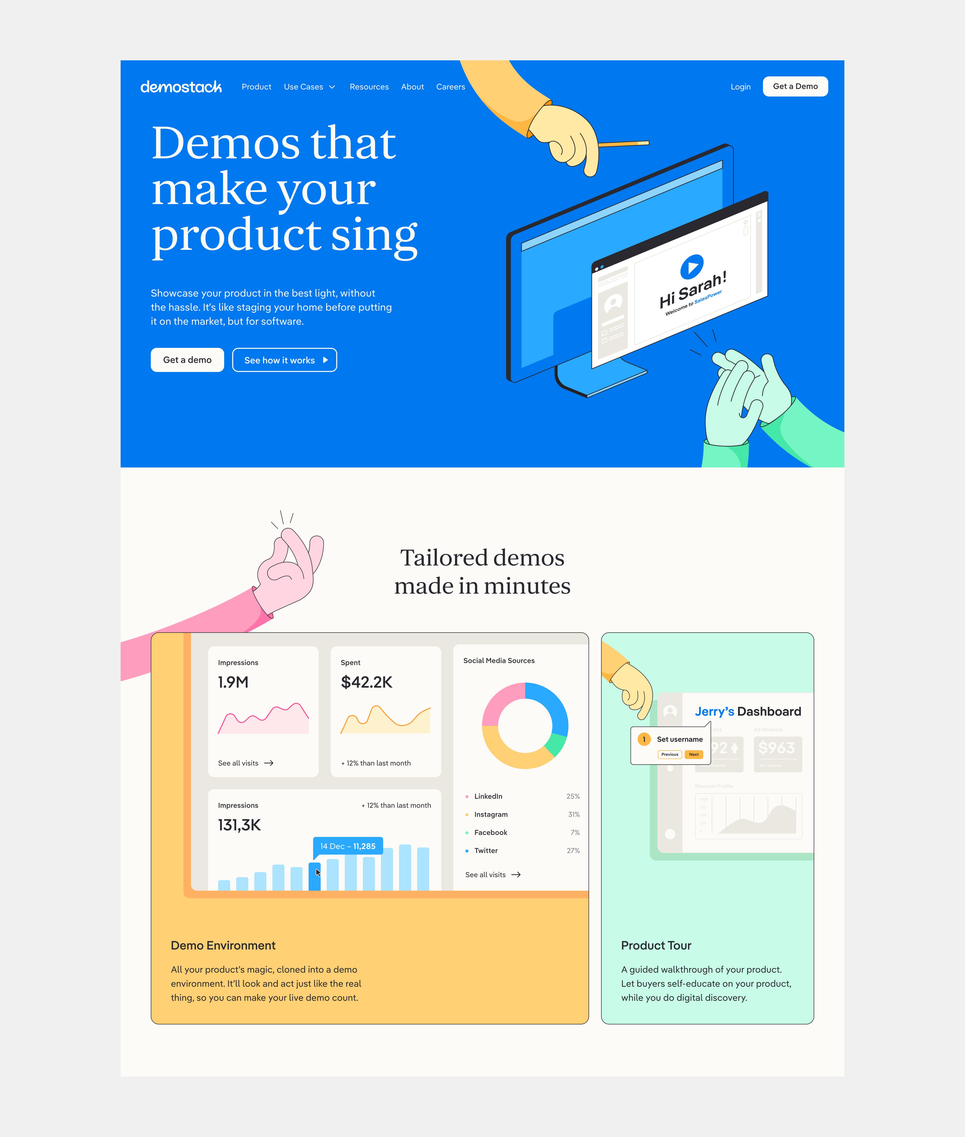
The homepage is where we introduce Demostack’s purpose with their new playful brand, followed by an introductory video of how it works. The hands are a prominent part of the brands’ visual communication.
Previous iterations of the homepage hero. Here I started to explore concepts around customisation elements of Demostack. But these lacked the impact or began to add unnecessary complexity.
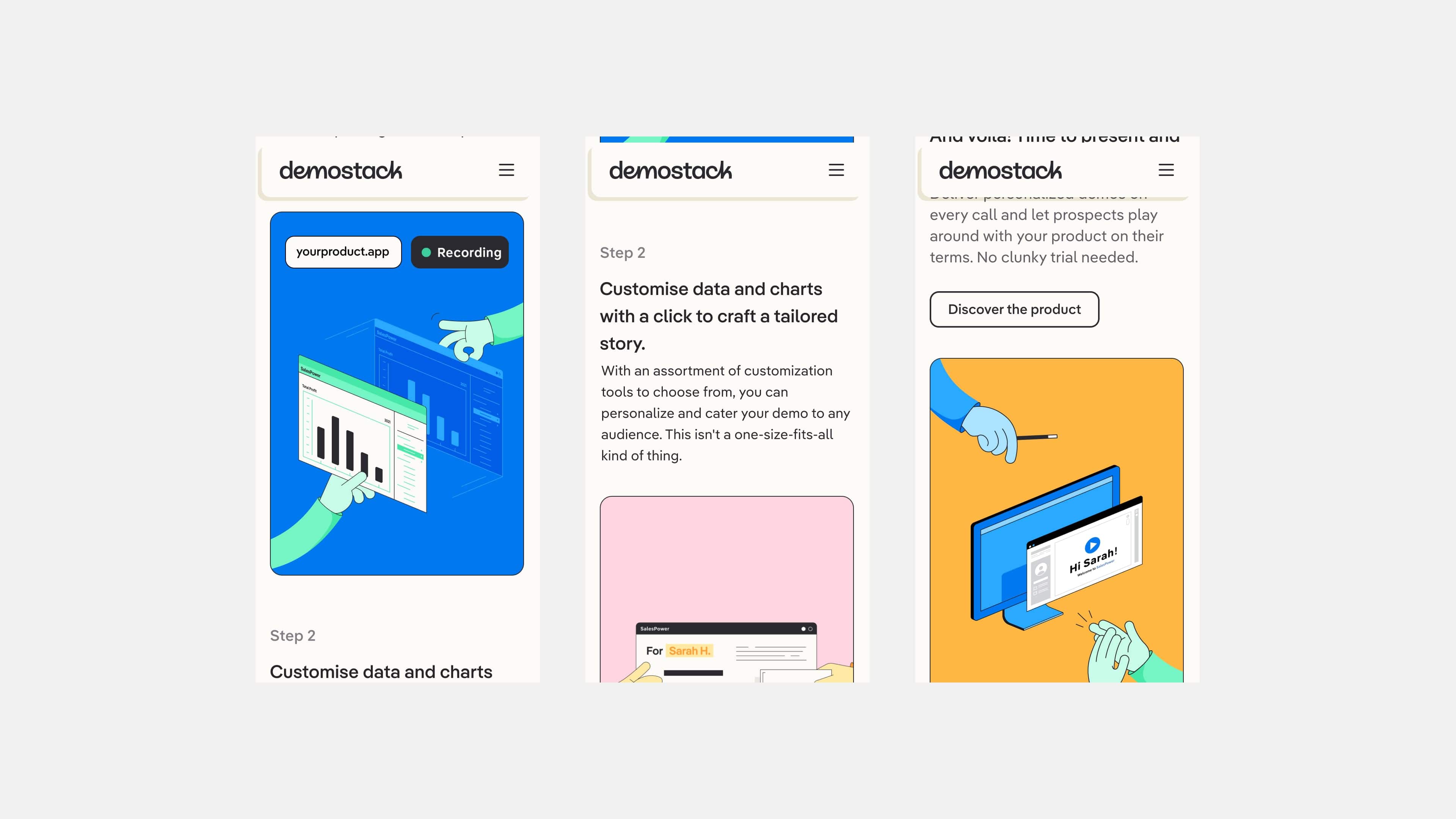
The process of creating a demo is explained using animations to efficiently visualise each step.
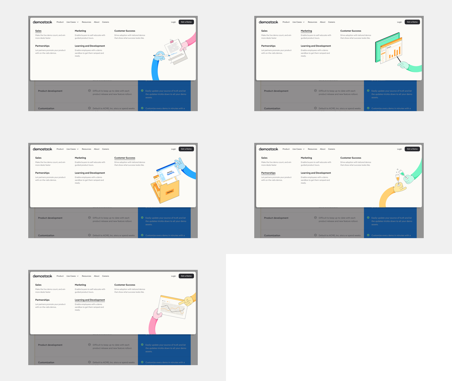
The site utilises animation often, a key part of the brand’s playful character and made wide use of Demostack’s colourful palette. Making this demo tool very distinct from its competitors.
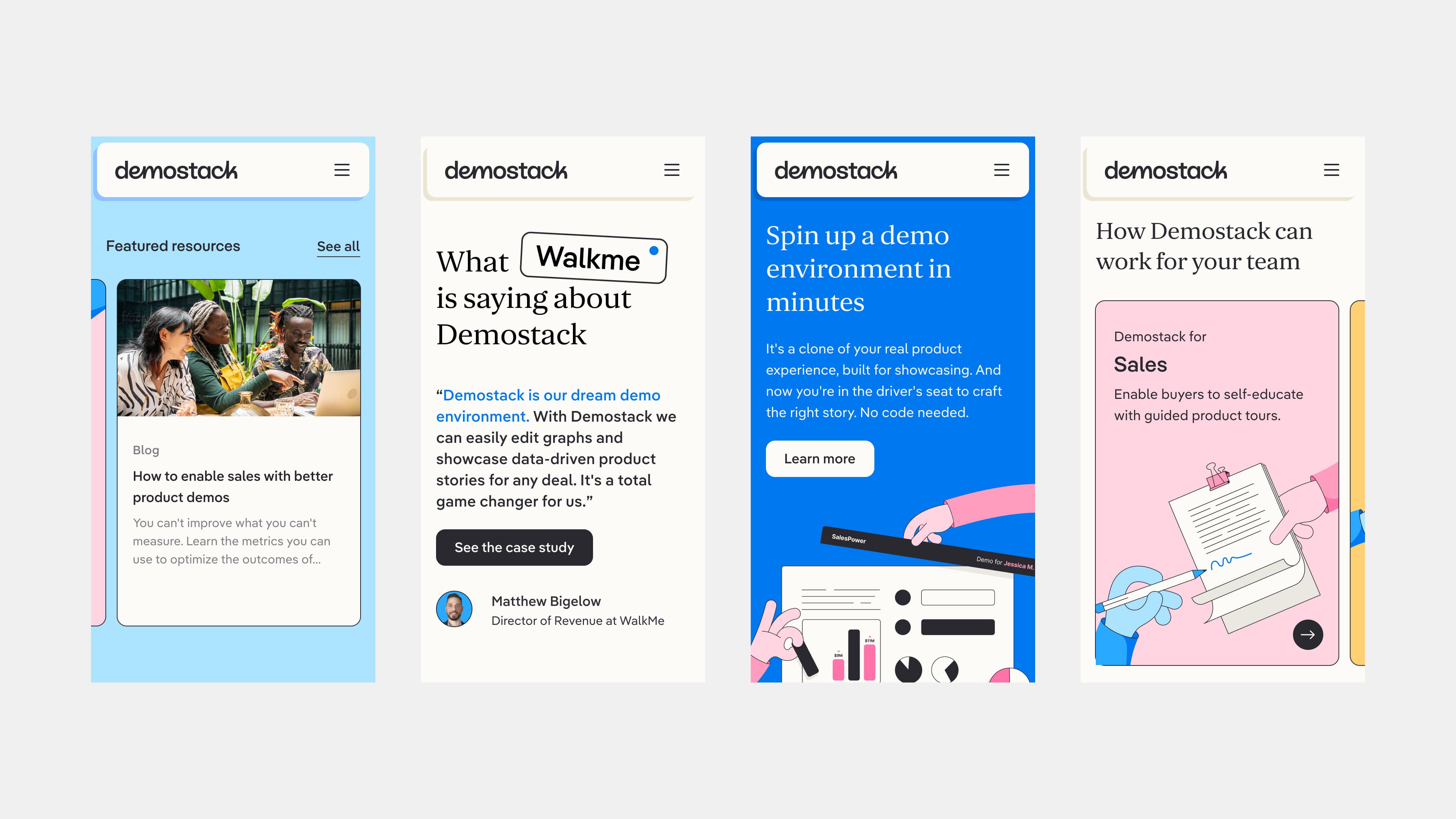
Product features in action are showcased through animated illustrations rather than screen captures. This was to help highlight specific elements in a simpler, focused manner which also aligned with the brand visually.
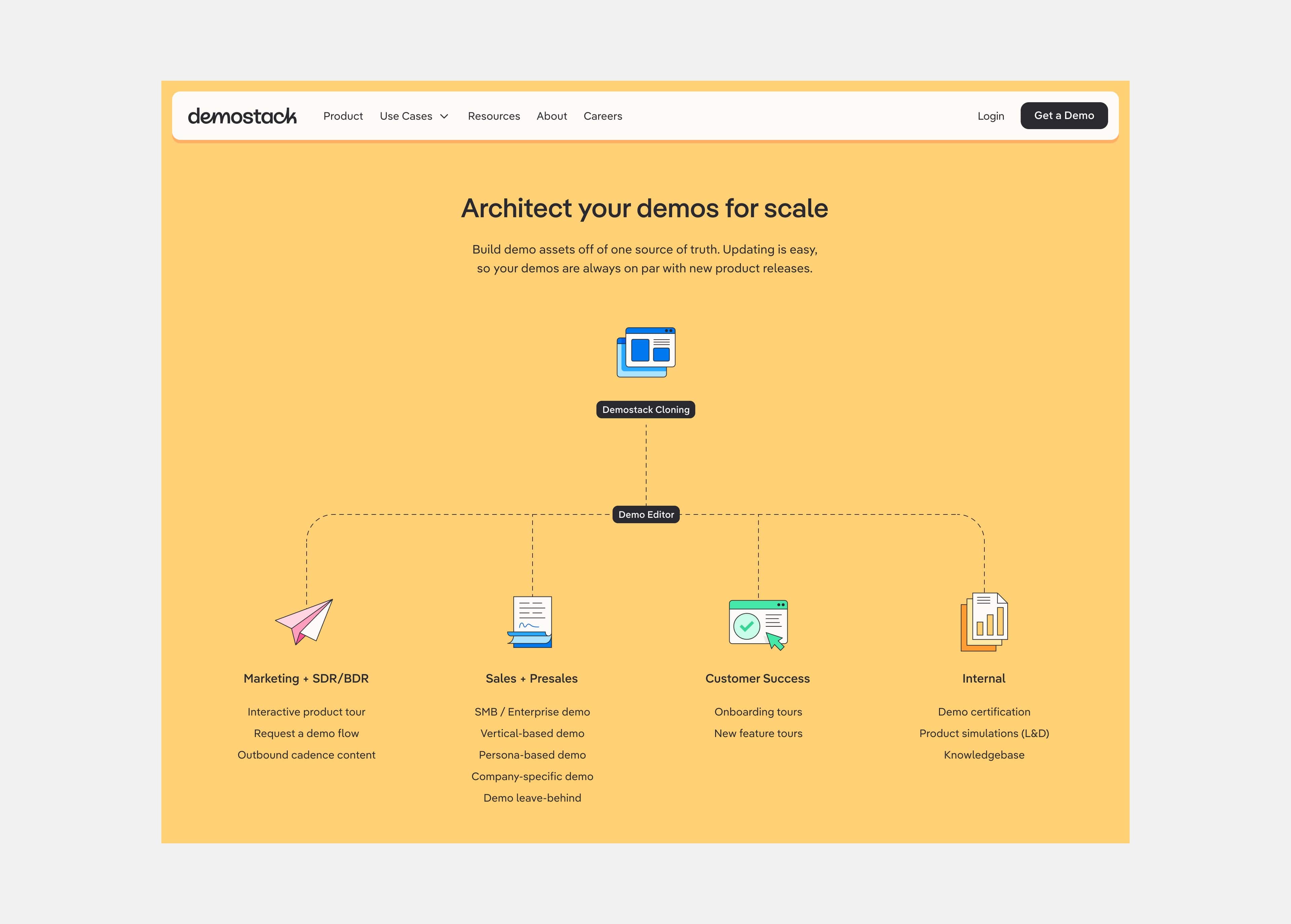
A more detailed icon set was produced giving lots of flexibility with the wide colour palette.
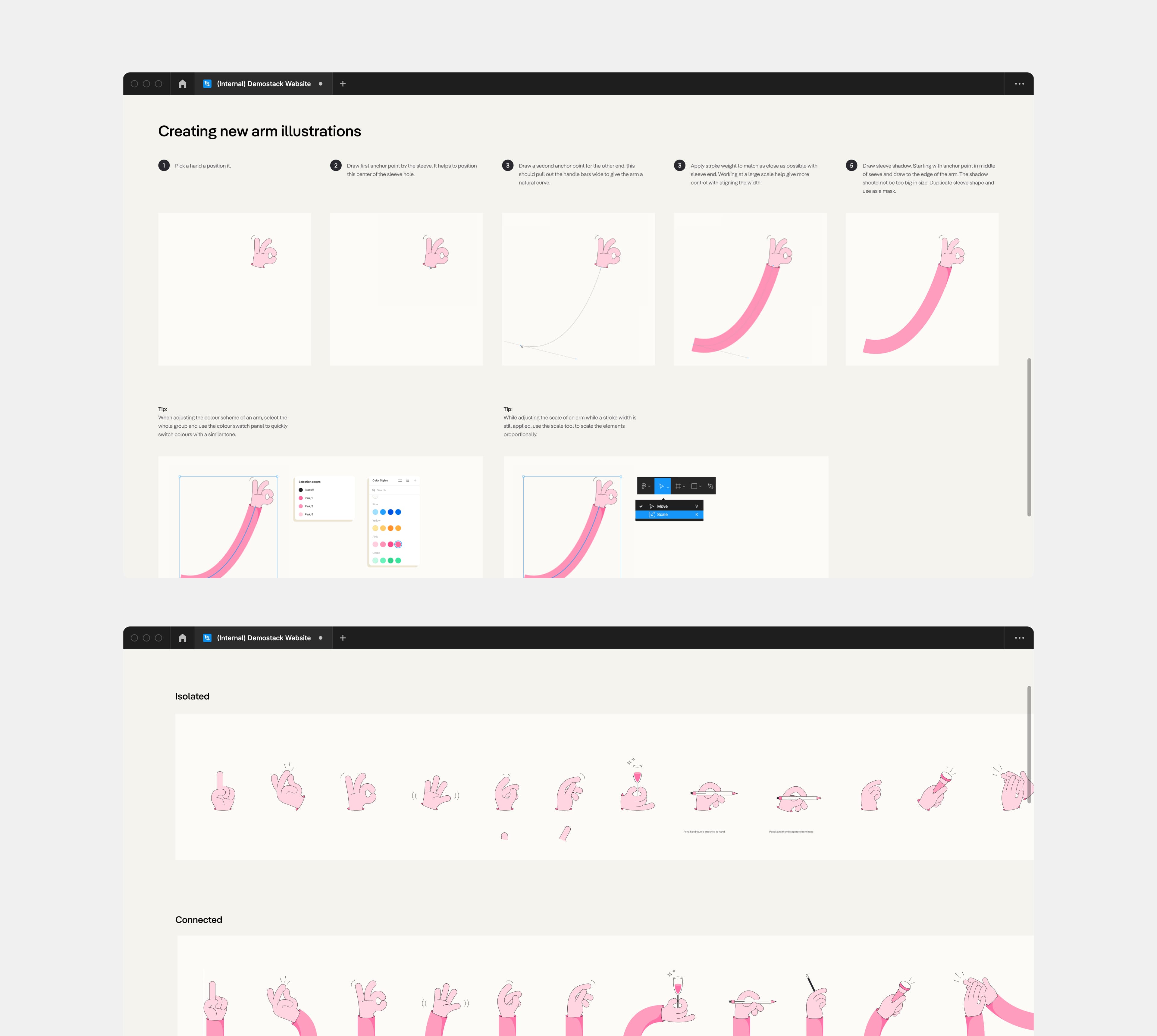
Alongside the design system and brand guidelines handover to Demostack’s internal team, guides/tips were also created to help other Designers get to grips with working with the illustration system quickly.
